
Despite having no impact on the actual combustion process, color serves as a critical component of candle design, often dictating a user’s initial perception of a product and the emotional response it elicits within a specific setting. In contemporary candle aesthetics, color extends beyond mere ornamentation; it functions as an integral facet of the holistic experience.
The Relevance of Color in Candle Design
In many instances, color is the immediate focal point of a candle’s visual impact. While a candle’s form, fragrance, and tactile quality all command attention, the color frequently establishes a pre-emptive sense of expectation. A hue that is muted, soft, and neutral evokes a feeling of tranquility and minimalism; conversely, an intense, vivid shade may suggest expressiveness or boldness. As such, color acts as the primary link between the candle itself and its intended identity, serving to convey both atmosphere and design language without the need for active engagement.
The Interplay Between Color and Ambiance
Candle color and interior aesthetics share a profound correlation, as color significantly impacts the mood created within a room. Consequently, color selection often involves consideration of the target space or specific ambiance the candle is meant to produce. A candle crafted for an uncluttered interior may favor neutral hues such as soft whites, tans, and pale shades, whereas one intended to serve as a decorative centerpiece might employ bolder colors with greater chromatic saturation and intensity. This synergy between object and setting allows a candle to transcend its status as a simple commodity and instead function as an environmental catalyst.
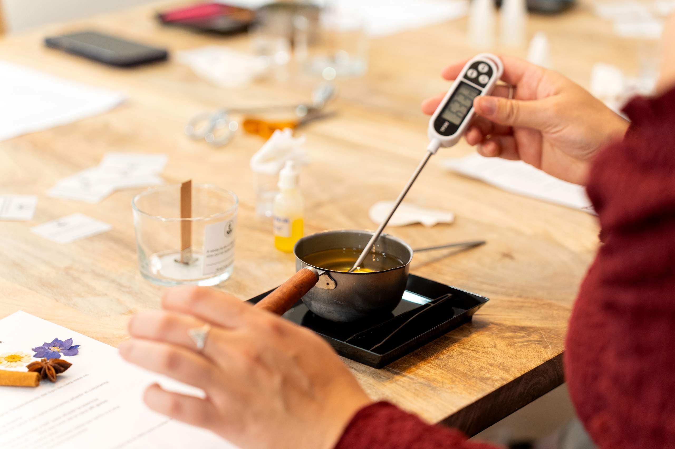
The Process of Dyeing Candles
Technically, candle color is achieved by incorporating colorants, such as dyes or pigments, into wax during the manufacturing process. However, the outcome is heavily influenced by variables including the type of wax, the temperature of the melt, and the concentration of dye. Due to these variables, a specific hue can appear dramatically different when viewed in a liquid state versus a solid state. For this reason, rigorous color testing remains a standard and necessary step within candle development; achieving the desired visual effect typically necessitates trial and error until the result is perfect.
Minimalism Versus Colorful Expression
Certain candle artisans gravitate toward a restrained color palette, utilizing subtle shifts and variations to maintain a streamlined aesthetic that relies on form and material quality. In this regard, color is treated as a secondary design factor rather than a central focus. Alternatively, other manufacturers utilize color as a medium for creative exploration, employing color blocking, layering, or unexpected combinations to generate visual interest and excitement. Regardless of the specific approach, the most crucial element remains the designer’s deliberate intent.
Color Within Branding
Among candle manufacturers producing market-ready goods, color assumes an additional significance: it becomes a branding asset. The maintenance of a uniform, consistent color palette is vital for establishing brand identity and consumer recognition. Many shoppers may already associate specific color schemes or styles with a brand simply based on visual recognition prior to examining the text on the packaging. Therefore, it is essential for candle designers to conceptualize color not solely as a design detail, but as an encompassing visual strategy.
Conclusion
The use of color in candle design, while sometimes understated, possesses a considerable capacity to influence and inform consumer perception. Color plays an active role in crafting first impressions, reinforcing mood and thematic resonance, and aligning a product with its brand identity. When wielded with purpose, color elevates a basic candle into a sophisticated design object that effectively communicates style and sentiment long before the wick is lit.